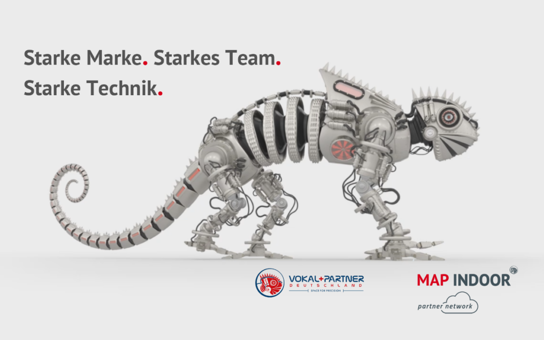
What is behind the Vokal+Partner logo? Over the last few years, many people have been asking themselves (and us) what the distinctive red icon is all about.
The idea was born back in 2011. Now the secret is out: it’s a MECHameleon.
The MECHameleon is our mission statement and stands for our contribution at the interface between matter and virtual reality. We are concerned with the mutual transformation of two worlds: Physical counterparts become digital, digital designs take on physical forms. This sets in motion a cycle of innovation and transformation that can continuously evolve.
The MECHAmeleon embodies a gritty, powerful, intelligent, technologically ever-perfected quick-change artist that knows how to navigate effortlessly in both worlds.
Our vision for a strong brand combines a strong team with strong technology.

